So, back from my long yet entirely predictable hiatus, I have decided to write a post rather fitting to the blog's rechristening. You see, I love all of the social sciences, and economics on its own can get a bit dry - in the same sense that I love broccoli on its own but would get sick of it within a week if I couldn't add in any other vegetables. I would much rather this blog resemble a tasty stir-fry than a plate of steamed broccoli.
With that metaphorical justification, I changed the title and focus of the blog to be less technical and more socially focused. Nowhere is there a better place to ease into that transition than in a discussion of income. Income, in this instance, takes on the economic definition which includes any money that is made from labour (wage/salary) or capital (rent, interest, profit) by an actor in the marketplace. Over the next few posts I am going to look at how to conceptualize income, how it compares across countries, alternate ways of measuring it, and what it means for people's lives.
Now, I'm sure you're all mostly familiar with Gross Domestic Product (GDP). It's the most common measure of economic output for a given country in a given year, and it is mathematically equivalent to income (because on the macro scale spending = output = income). One of the ways of measuring a country's wealth is by calculating GDP per Capita, which takes total annual output and divides it by the number of people. By this measure, Canada is one of the wealthiest countries in the world - but the real question on all of our painfully self-conscious Canadian minds is "How do we compare to the U.S.?"

That's right, your eyes don't deceive you: as per these recent numbers, we almost equal to our inherently superior Yankee neighbours! But the story doesn't end there, as that would make for a rather uninformative blog post. You see, this particular graph converts all numbers into US dollars. The problem with that is that the American dollar (USD) has been falling recently and has a habit of fluctuating to a considerable degree in comparison with the Canadian dollar (CAD). A more accurate picture, then, makes use of what is known as Purchasing Power Parity (PPP). This compares the countries by what goods and services can be purchased using the currency in each, rather than simply how many units of each other the currencies can buy. GDP, adjusted for PPP, is at once a more stable measure and one more indicative of what a person's dollar income can actually buy them.
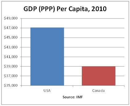
Oh dear. What this means for us in practical terms is that our dollar is overvalued compared to the US dollar. Our wealth as measured in nominal (compared to USD) terms is deceptively high, likely the result of short-term exchange rate fluctuations that don't reflect real price differences. According to per capita GDP comparison using PPP, we are in fact much poorer than the first graph would let on.
Is this cause for panic? According to a measure that takes all the output in our economy, divides it by the number of people, and compares it by purchasing power, we are considerably below the US. Can you think of any reason this analysis might not give the whole picture as far as economic wellbeing goes? I think I'll pause here and give you some time to think it through and decide whether you ought to be donning your stars and stripes just yet. Stay tuned…